HOW CAN YOU IMPROVE YOUR PICTURE COMPOSITION?
How to achieve good picture composition – the first thing to realise is that good picture composition does not have to be confined to landscape photography. All pictures, whether they are photographs of people in the street, animals, portraits or still-life, will have the power to attract your viewer’s eye – and hold it within the picture – if the composition is based on sound principles.
So how do you improve picture composition?
Answers vary according to the subject. For this reason, hard rules, despite what some photographers and many artists might tell you, don’t work all the time for every subject. You can, in fact, sometimes even make up your own rules as you go along.
I have used here, quite deliberately, only black-and-white images. That’s because pictures in monochrome are much simpler to explain in terms of good picture composition. As soon as you introduce colour, a whole new set of variables are involved. For instance, areas, or even small details, of different colours can be used to balance or imbalance an entire composition. More about that in a future article. For now let’s keep it simple and stick to B/W..
The key to good pictures composition – the magic No. 3
The key to good picture composition is the overriding importance of attracting, and holding, the viewer’s eye within your picture. The pictures below conform to no absolute rules that I know of except that the human eye nearly always responds favourably to the magic number 3.
There is an obvious triangle of leading lines in the first picture A – and triangles (that magic number 3) can be highly effective and pleasing.
WHERE DO YOU LOOK IN PICTURE A?
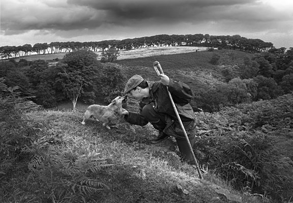
Where does your eye go when you first look at this picture? There is a clear triangle within this composition
This is a very simple triangular composition and I’m prepared to bet that when you first looked at this photograph your eye went directly to the area that contains the faces of the man and the dog, and quite rightly so. There are two reasons for this.
You are human and have a natural desire to find out what other people look like.
Your eye was guided there because that area of the image is contained by three leading lines created by lighter tones of the grass, the stick and the dog’s head.
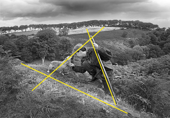
Notice those leading lines and how they lead your eye to the most important elements of the picture
The whole image is ‘capped’ by the dark area of the skyline and dark clouds. Therefore your eye should certainly head up there to gather information, but it is naturally drawn back to the lighter area in and around our triangle.
WHERE DO YOU LOOK IN PICTURE B?
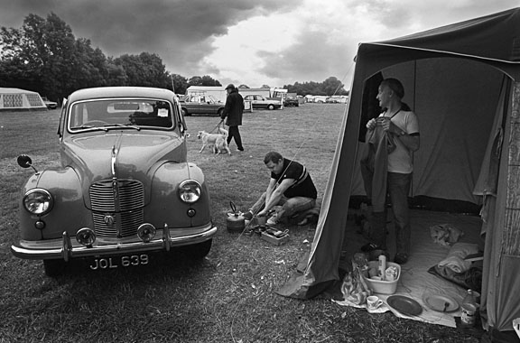
A more complex but still triangular composition
The composition of picture B is far more complex. There are many compositional elements, three eyelines and several triangles; one of these is more dominant than the others.
I suppose if you are a vintage car enthusiast you may look at the car first. Most people will look first at the man cooking breakfast in the middle of the composition. The eye will probably move up to the face of the man in the tent because it is pulled by curiosity and the diagonal slope of the tent roof.
The eye goes round and round a good composition
Chances are that the eye will then go to the man with the dog, then to the car, where the headlight on the left acts like a full-stop. From there the eye moves back into the tent gathering information about the interior floor before starting its tour once again. Each time the eye goes around the composition it gains more information.
By the way, this pictures was taken for The Sunday Times at the gloriously-named Sandy Balls Campsite, in Dorset, It was printed very big without any cropping.
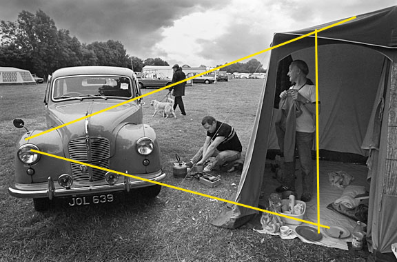
The same picture with the obvious leading lines highlighted in yellow
Three things to remember about good composition
- Three is the magic number
- Eye lines – that means the direction in which a subject is looking – can become leading lines
- Lighter areas attract the eye like a moth to light
Good picture composition awareness
When this article first appeared I was asked by a well-known artist painter – ‘just how aware is a photographer of all the rules of composition when actually taking a picture?’ A painter, after all, has time to consider and plan the composition even before paint touches canvas. Often a photographer has little or no time to plan, and must capture the image as it presents itself.
Let’s take the question a few steps further and ask how much can an understanding of the rules of good picture composition help a photographer capture a better picture – or, indeed, might an understanding of composition actually hinder or even inhibit a photographer?
You can learn about picture composition on a 121 course with Philip Dunn in Shropshire
My belief is that the more you know about good picture composition the easier things become and the more you can push back the boundaries of photography and express yourself.
I know my artist friend is very talented and successful – he can paint the most beautiful portraits that capture the very essence of his subject’s personality. But he can also paint landscapes, and boats, and houses – in fact, he can paint just about anything he wants to paint.
Why? Well, mostly because he is talented, but I suggest that part of that talent is borne of understanding and training. You see, he is a very fine draughtsman. He understands the rules and the basics of good composition.
It is the same in photography.
Pictures that can’t be cropped
When I was working for The Sunday Times, I was known on the Picture Desk as the photographer who took pictures that were difficult to crop. Now, shooting pictures that could not be cropped was fine for a newspaper like The Sunday Times – they really appreciated good photography and were prepared to use big pictures that included all the photographer intended to include in the composition – however, I do not recommend this strategy for most freelances trying to sell their pictures.
In truth, you can crop any picture – you simply cut a piece off the image. But not if you want to preserve the integrity of the whole composition, the subtle linking of one part of the composition to another, and the whole meaning and context of the image.
Good picture composition helps tell the story
I enjoy producing pictures in which every part of the composition is in some way linked visually; pictures that need all their elements to tell the whole story. I am fascinated with this concept.
The example here might help explain what I’m trying to say. It shows a street scene in Jaipur, India,
How the photograph was taken
The obvious potential of a picture with the cows in the foreground was spotted immediately. So, naturally, I positioned myself to include them in a fairly wide-angle photograph of the street – a very busy place with people moving around all the time.
I took a photograph (get one in the bag – the cows might move). Glancing behind me I saw the cycle rickshaw and lady with her three children coming towards me. So I turned back towards the cows and the street scene and waited for the people and the rickshaw to pass me knowing that they might create another interesting part of the whole composition as they moved into the picture.
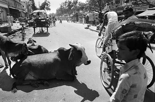
A fraction of a second later everything came together – see the final picture below
As they got just in front of me I started taking pictures – this was a single shot film camera. The first shot was just a little too early and did not work. The second shot worked perfectly.
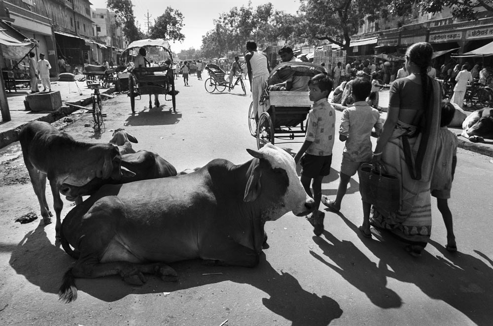
Everything came together at once. The people, the rickshaw, the cows, to create a circular composition that takes the eye on a ride around the picture
The point is – I knew absolutely that the composition was going to work a fraction of a second before I pressed the shutter. Everything came together: the rickshaw overtook the family and moved further into the picture while one of the children kept his eyes on me. At this precise moment the other rickshaw up the street pulled into the road to turn around. The composition was complete – the circle joined up. I pressed the button.
I also knew when I took the picture that the composition had a circular form in which the eye might move around the light area in the middle gathering information before heading round the picture again to see more.
In conclusion, there will usually be one decisive moment when everything comes together. It’s up to you to develop that sense of timing, and that will only come with practise.
TIPS FOR GOOD PICTURE COMPOSITION
- Develop a ‘feel’ for the moment when all the elements of composition come together and gel. This takes practice.
- Always be aware of subjects moving around you – and check behind to see what’s approaching.
- Think ahead – anticipate the action.
JOIN PHILIP DUNN IN SHROPSHIRE FOR A PHOTOGRAPHY WORKSHOP
This article, written and illustrated by Philip Dunn, first appeared in Amateur Photographer Magazine
